Maintaining Color Accuracy in Interior Photography

A couple years ago, I scored a vintage Henry Link hutch from a resale shop for only $125. Its pale yellow exterior needed to go. So immediately I took the plunge into the black hole of choosing a paint color.
My word. Choosing a paint color is a maddening process. Now, you’re a professional designer, so you get there much quicker than me. But I know for a fact the color you chose was slightly nuanced from its contenders, and you made that very specific selection for a reason.
(FYI, I went with Sherwin Williams Oyster Bay. Faux bamboo has never looked so pretty.)
At the risk of being dramatic, the images we create at a session are the artifacts of your life’s work. So the colors in paint, furniture, art, etc. must appear in the photo just as it did in person.
Getting it Right in Camera
Your photographer could rely on the editing process to fix color tones. And sometimes we have to due to time constraints or because we’re using a method that’s specifically for the editing process (more on that in a minute).
But colors turn out cleaner and more accurate by capturing them correctly in camera at the session. This is one of my biggest goals when we work together: make sure I maintain color accuracy of your design as we photograph each space.
The Three Methods for Maintaining Accurate Colors in Interior Photography
To make sure colors in your spaces turn out accurate, I use three methods:
shoot with the room lights off
hang a silk (large white sheet)
incorporate artificial lighting
Let’s take a closer look at each.
Shooting with the Room Lights Off
This is the quickest solution to maintaining color accuracy, and it’s the first thing I ask you to do when we start shooting: “Let’s kill those over head lights.”
Overhead lights tend to create messy, odd color tones.
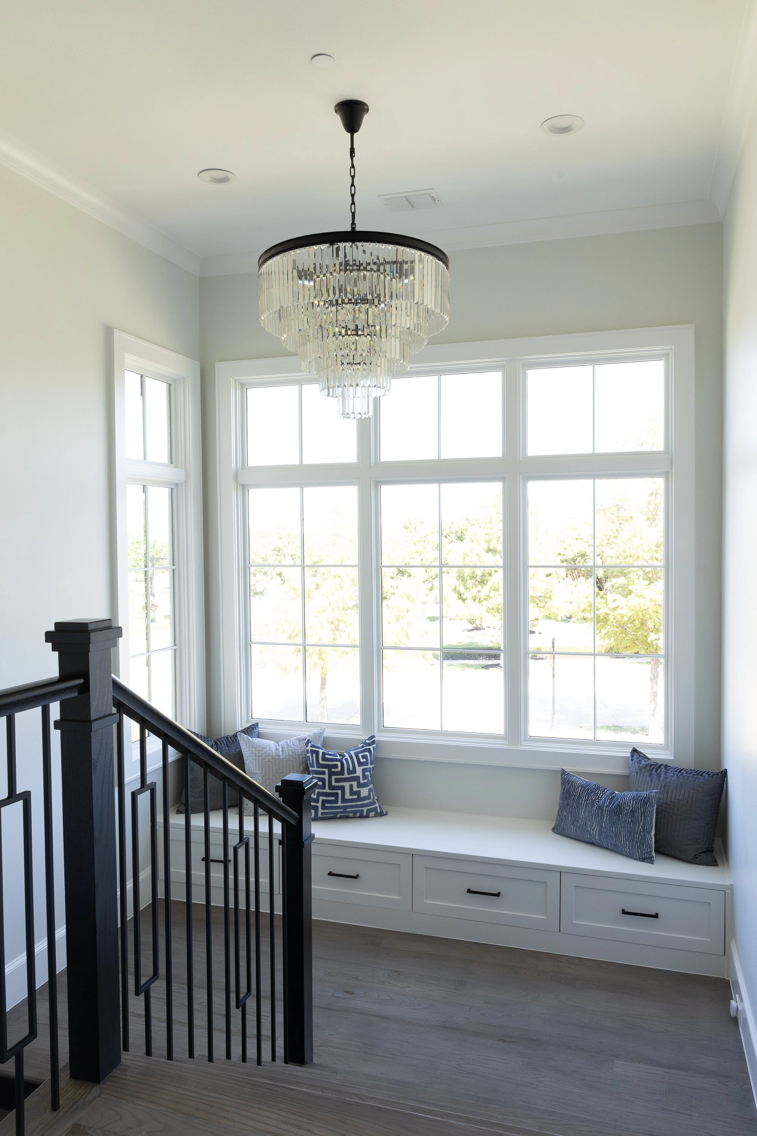
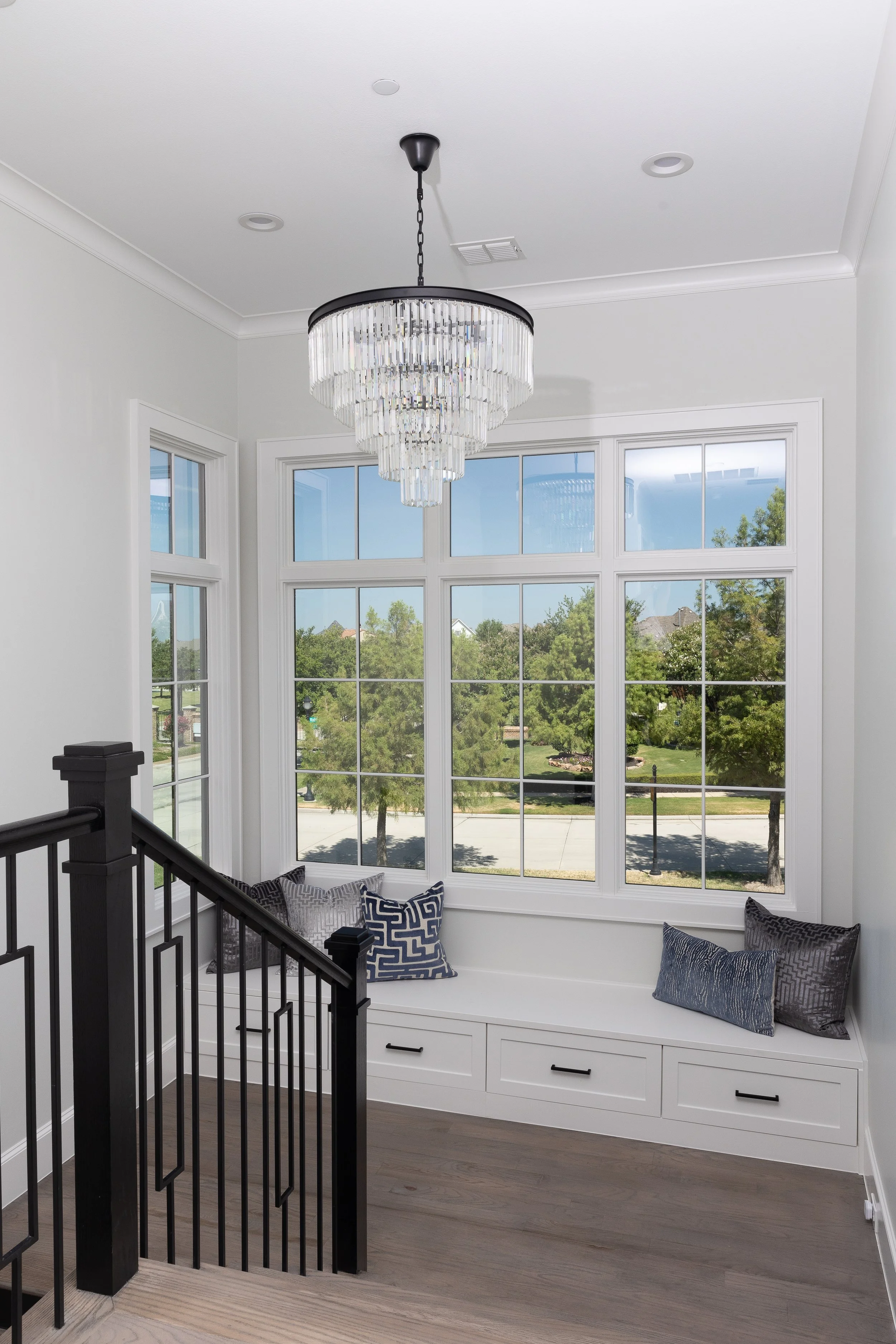
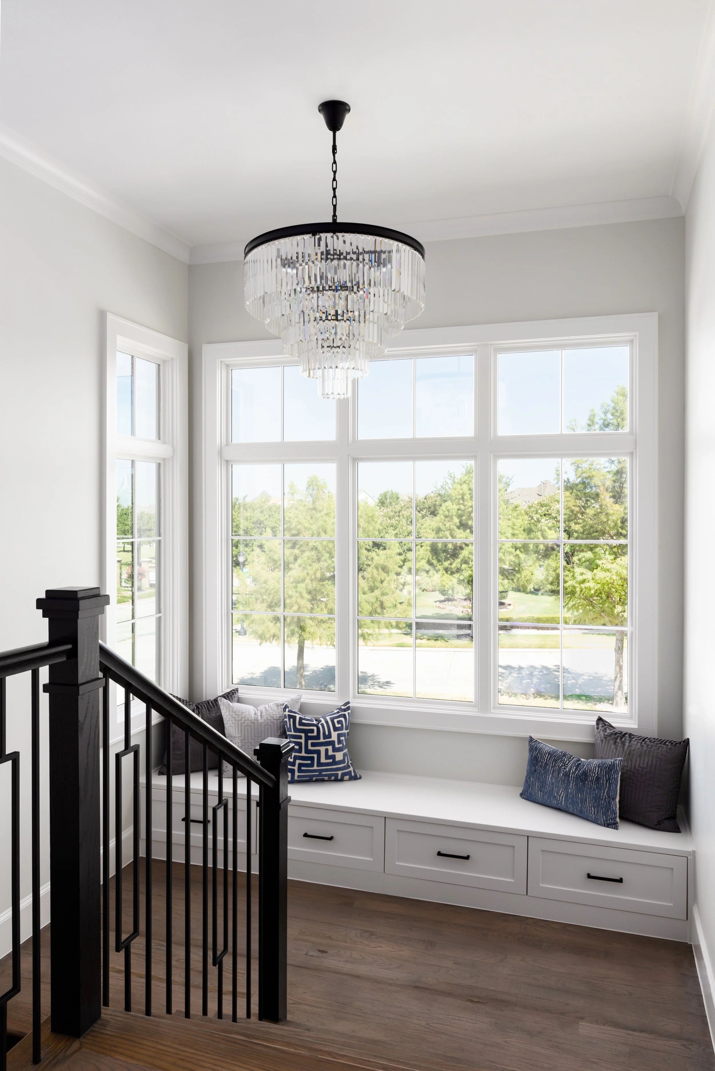
In the image below, see how the room lights affect the lavender color (and creates and overall distracting image that takes way from the designer’s work). The natural light version is much cleaner.
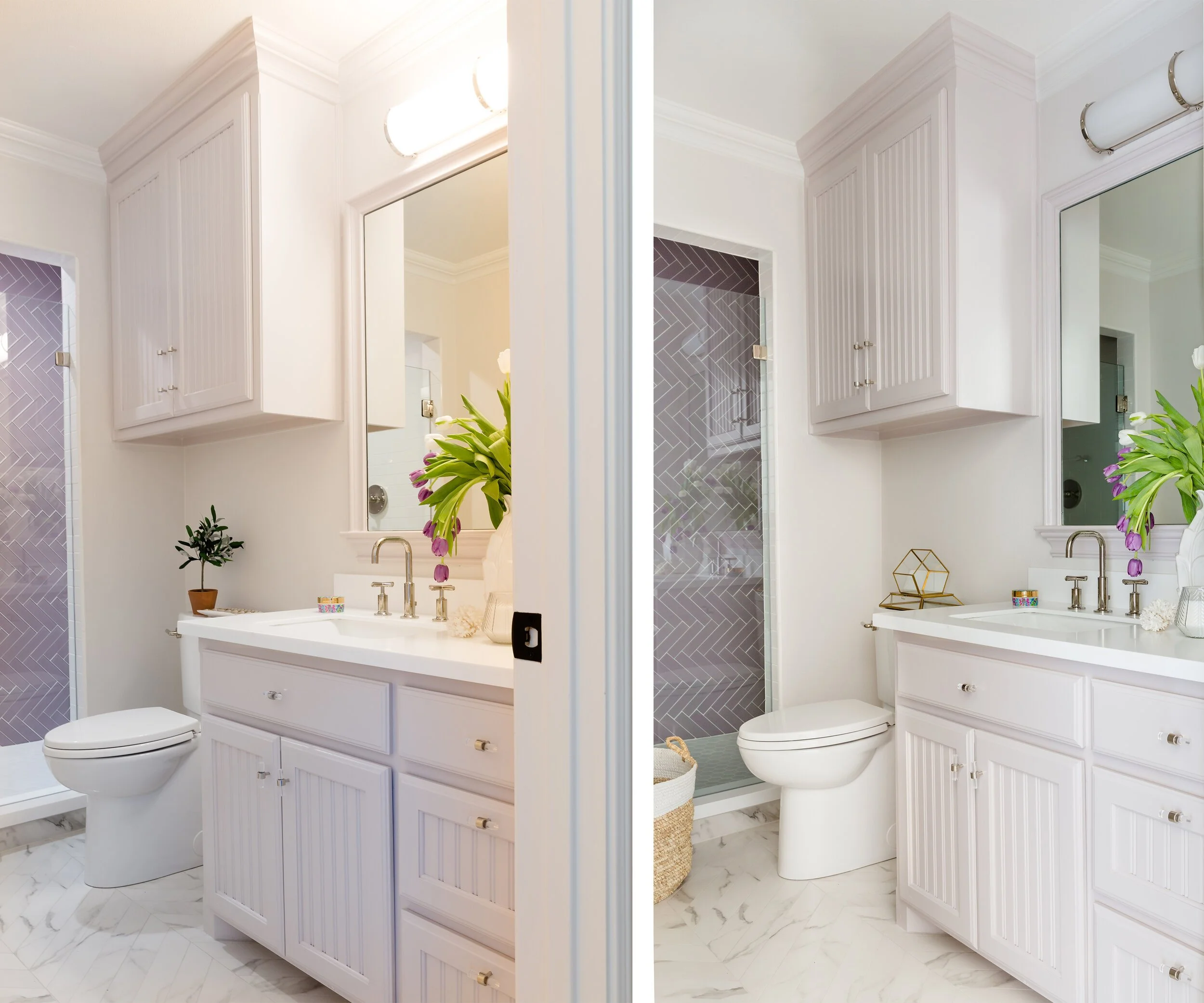
Turning off room lights allows for a sleeker, cleaner image with true color tones. Design by Towne and Main
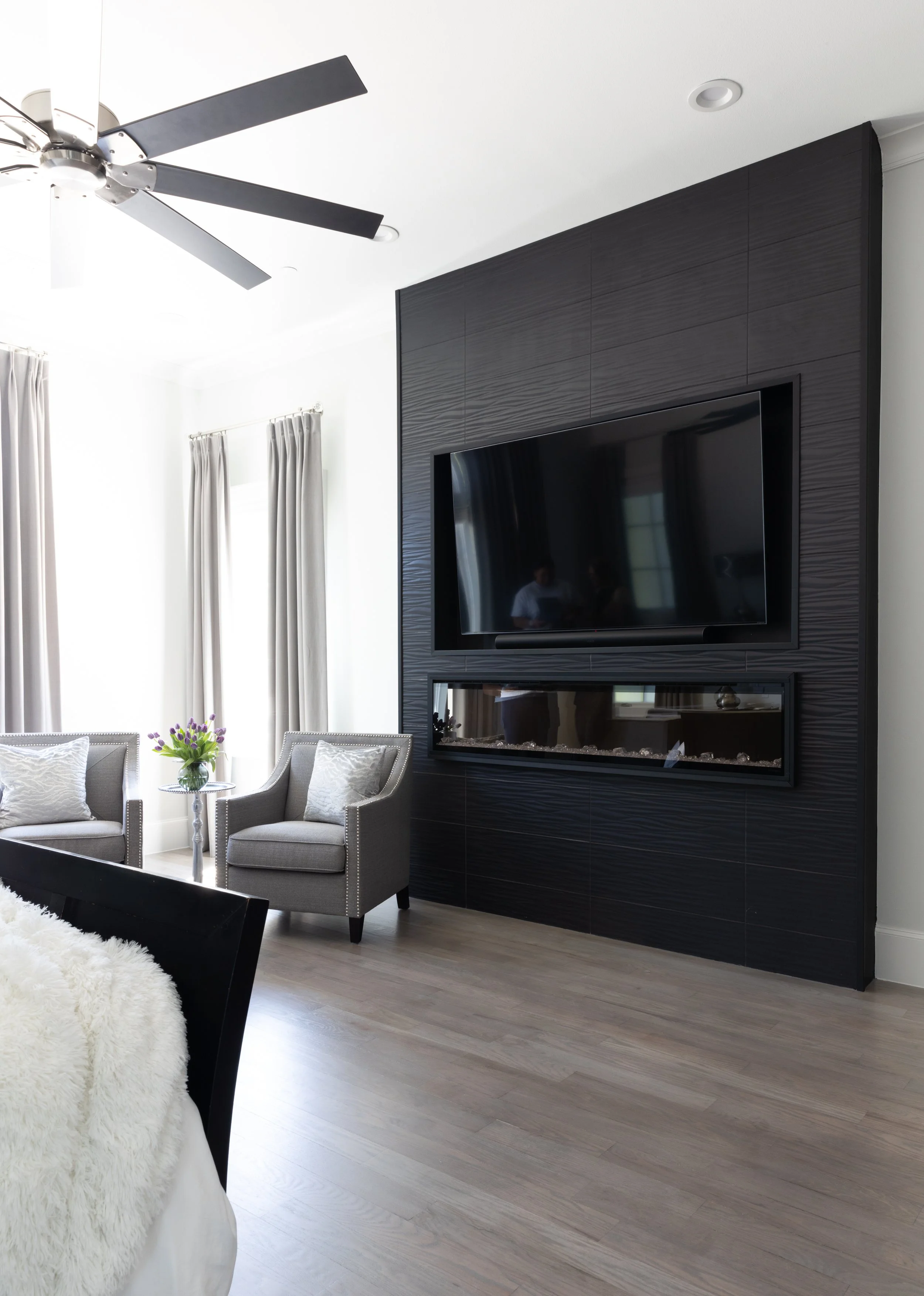
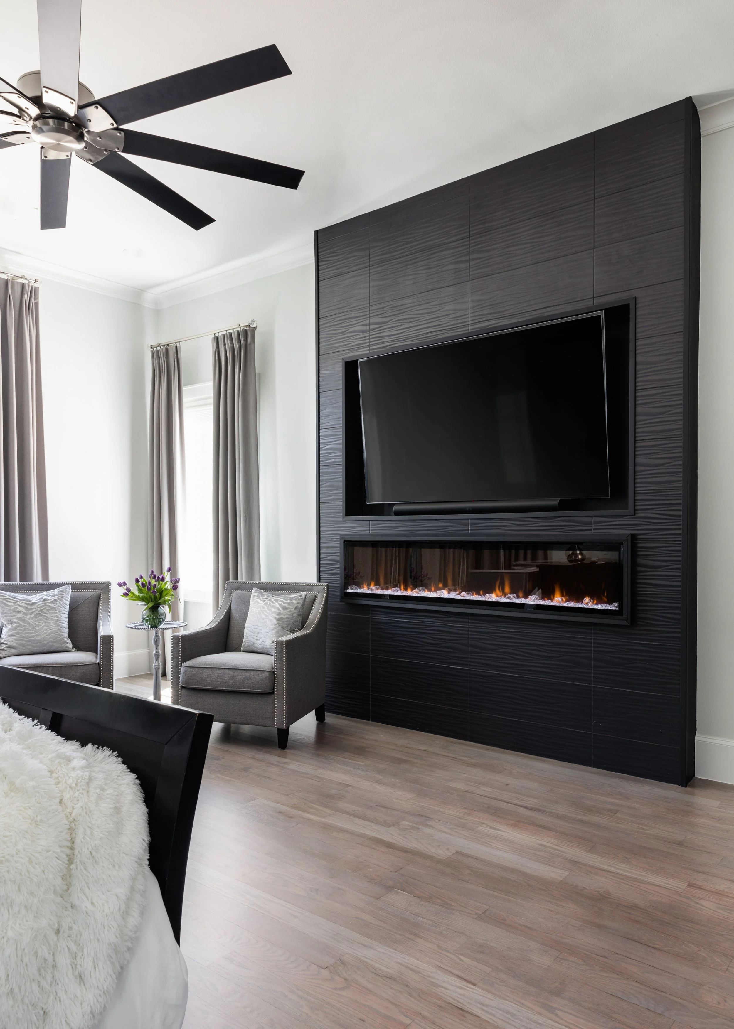
Often a designer asks to keep the light on to capture a feature light (e.g., sconce, pendant, lamp), and we can totally do that!
I will snap two photos: one with the lights off and one with the feature lights on. This gives me the “data” I need to blend in the feature lights when I edit so we get the best of both worlds—clean, accurate color in the overall space with the feature lights on.
The examples below show the results of this blending process when I edit:
The viewer can see how these unique feature lights work without the lights affecting the color accuracy of anything else in the room. Design by Beyond Interior Design

Inside the glass shower, I intentionally used the recessed lights to bring more light into that corner, but you can see the color coming from them is neutral and clean. Design by Chelsi Hix; build by Creative Elements.
Hang a Silk
Turning off overhead lights is often not enough, because we have another light source to deal with that can cause color issues: window light.
In these scenarios, I use a silk. A silk is a large white sheet I hang in front of a window or just outside the camera frame. It’s easily my favorite tool I use in my shooting process! The silk filters light through a single, white source, neutralizing odd color casts created when the sun reflects off the sky, the ground, trees, or anything outside that bounces back into the space.
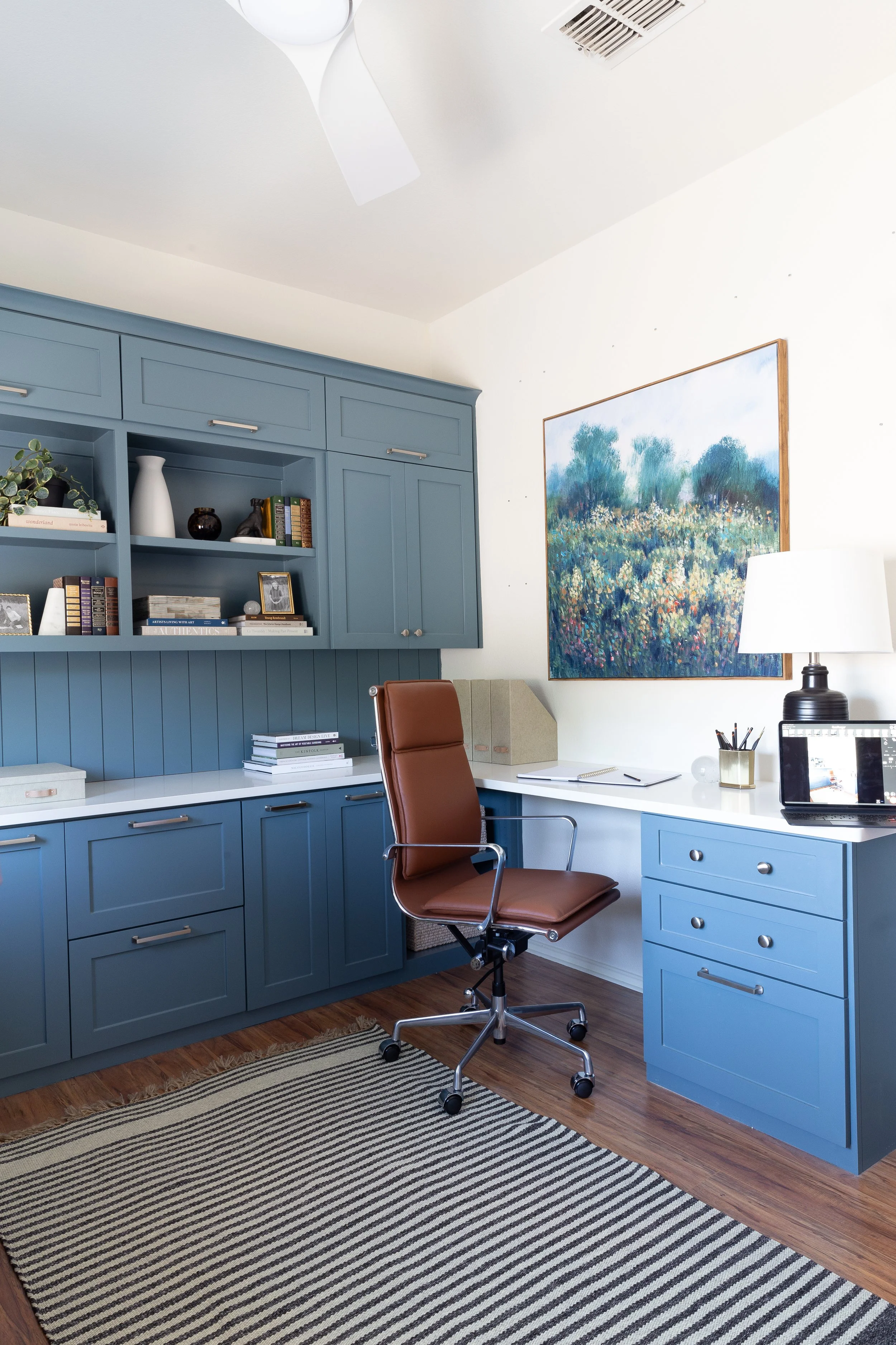
Here’s a great example of how the silk creates smooth, accurate coloring on the blue cabinets:
Before the silk: Notice the extra cool tones falling onto the cabinet color created from the window light bouncing off the sky. Design by Alisa Cristine Interiors

After the silk: Hanging a silk in front of the window (see placement below) removes the overly cool color cast by filtering all the natural light through a white source. Design by Alisa Cristine Interiors
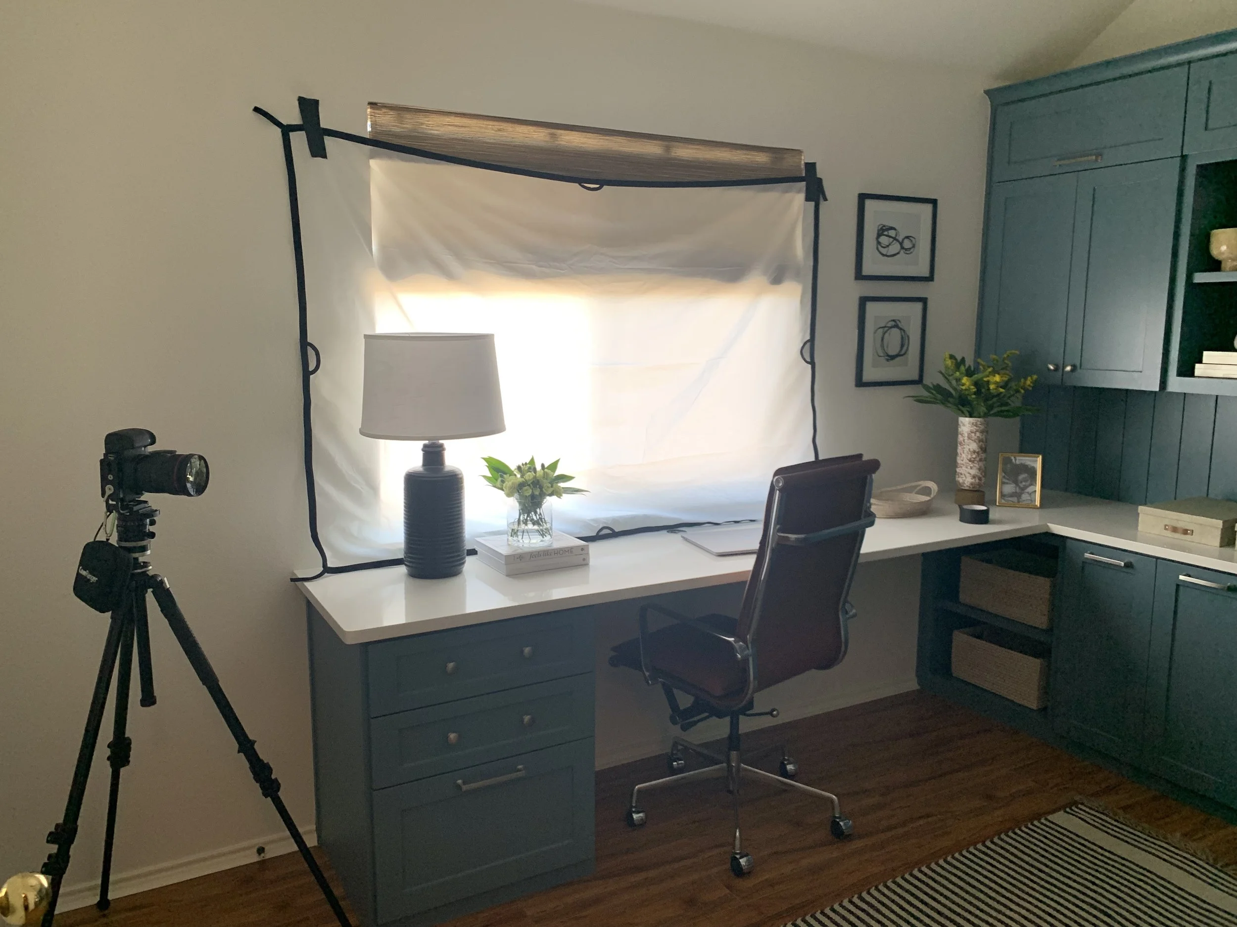
I placed the silk over the light source—the window across from the desk space we are photographing.
Typically if the window is in view, I hang the silk outside by leaning it against or taping it to the window. If the window is not in the frame, or if we’re shooting on the second floor of a home and cannot access the outside (in the example above), I hang the silk inside.
BONUS: In additional to maintaining color accuracy in interior photography, using a silk also eliminates weird shadows caused by blinds, shutters, or anything just outside the window.
In this example, look at two areas: the wall behind the tree, the door and the rug. See how the silk removes the textured shadows on the wall and neutralizes the color in the door and rug?
Before hanging the silk outside the window: distracting shadows on the wall behind the tree, green cast on the door, and overly blue tones falling on the rug. Design by Beyond Interior Design

After hanging the silk: the paint on the wall is smoothed out creating an over sleek, finessed look and feel to the image that now has accurate coloring everywhere. Design by Beyond Interior Design
Here’s another great example showing how I used a silk to both eliminate color casts and remove distracting shadows:

Before the silk: distracting shadows, green/yellow tones on the dry wall; Design by Beyond Interior Design
After the silk: super smooth shadows and clean color; Design by Beyond Interior Design
Using Artificial Light
Just like the silk cleans up color, so does my strobe.
Now, most of the time when I’m shooting with artificial light, I take the image with a combination of natural light and strobe light to create the final look in camera. But sometimes if I’m getting odd coloring with the natural light frame or when I mix the two light sources (natural and strobe), I’ll take a shot using only strobe light—simply for the color.
Without bogging you down in the technicalities, there’s an editing technique that allows me to brush on the color from one frame (the strobed shot) onto another frame (the natural light shot). That means in editing, I can create the final image where the light is falling into the spaces the way I want and with accurate colors.
Here are the two frames I layered in Photoshop for the final look:
Natural light shot: a messy mix of blue on the floor and orange on the ceiling; Design by Delany Designs
Strobe shot: clean, even coloring; Design by Delany Designs
Here’s the final image where I use the lighting from the first image and the coloring from the second image:
Here’s an another example: take a look a the floor color, particularly around the glare.
Natural light only frame: odd coloring on the floor, including the blue outline on the glare Design by Delany Designs
Final image that blends natural and strobe light: the floor is now a clean color with no distractions; Design by Delany Designs
Final Thoughts
If you’re new to hiring an interior photographer, know that these things take time. And I encourage you to give your photographer the time they need, because they’re probably just doing what they need to do for your designs to look stunning!
Good interior photographers will not rush through a job to get it done or make the day shorter—they will take their time to make sure they deliver beautiful, clean images that maintain color accuracy.
Sarah is an interior photographer based in Dallas, Texas. She photographs residential spaces to help interior designers book ideal clients and get published.