Brooks-Thomas Feature in Milieu Fall 2022
You know the advice often give to entrepreneurs and artists to “niche down?” I can’t think of a more prefect example of this concept executed than Brooks-Thomas Studio.
In a most thoughtful way, Brooks-Thomas curates textiles, wall coverings, and furnishings for the home, sourced from British-only makers, artists, and brands. Super niche, and I am here for it! Available to the trade, this truly unique space and its across-the-pond product lines are located in the heart of the design district on Slocum Street in Dallas, Texas. Stop by if you’re in the area. You will not be disappointed with this spaces, its offerings, and its owners (see below).
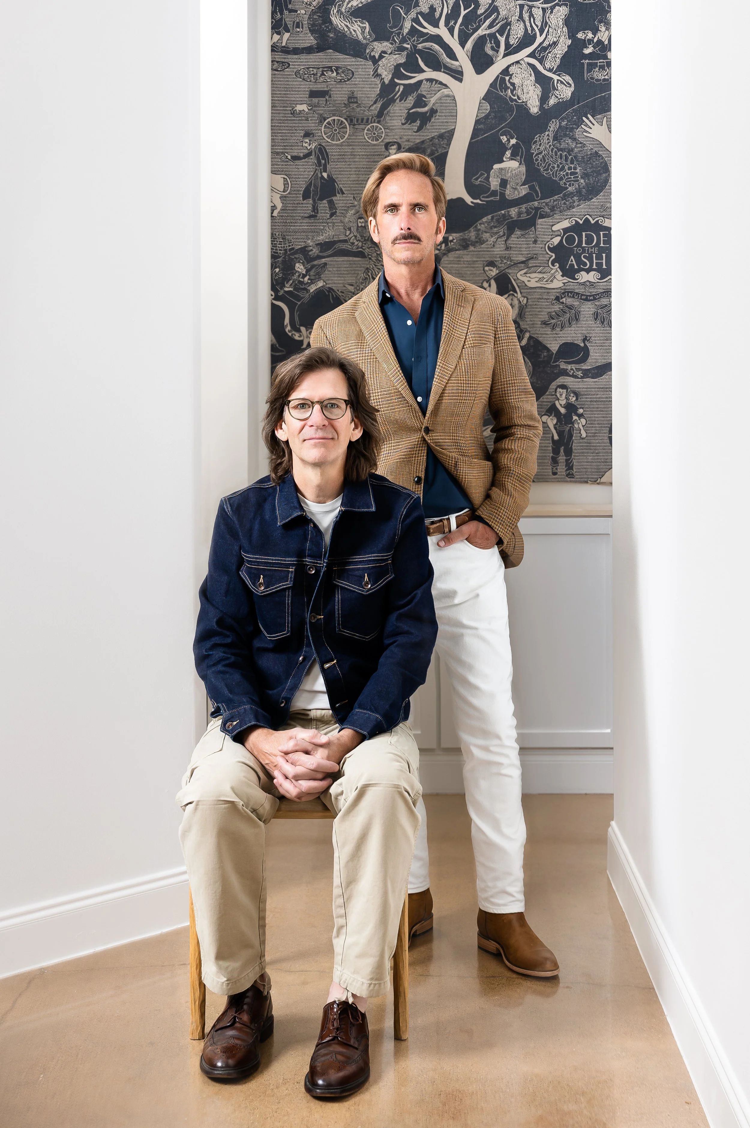
I was truly honored when owners Daniel Weisbach and Brian Moss (photographed below) hired me to photograph their space featured in Milieu Magazine’s Forward Thinkers. So kind and lightheaded, the duo has a combined background in high-end retail and graphic design that has culminated into this hyper niche studio.
Furnishings showcased in the backroom filled with foliage and light
Brooks-Thomas owners Daniel Weisbach and Brian Moss
Rose Uniacke textiles in Brooks-Thomas entry area, available right here in Dallas, Texas
Daniel Weisbach captured in action (unknowingly!)
Brooks-Thomas feature in Milieu Magazine, photography by Dallas, Texas interior photographer Sarah Linden
Lovely mix of British-sourced wall coverings, textiles, and furnishings in the Brooks-Thomas studio
Obsessed with this punchy colorful scheme
Opting for Strobe Lighting over Natural in Interior Photography
Most wouldn’t choose fake over authentic, but often with interior photography, artificial is the way to go—particularly in an ambient light scenario like this one where the natural light is coming from the numbers skylights overhead.
While there was no shortage of natural light in this space, I wanted deeper shadows and more directional light than the skylights were giving me.
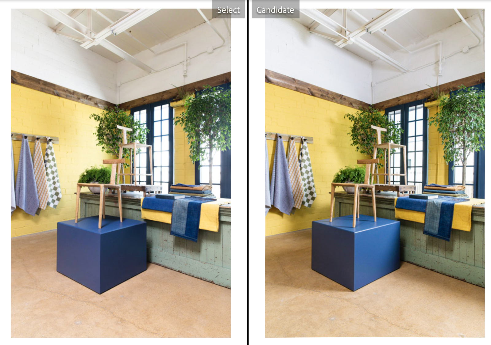
By strobing every shot, I was able to put the light exactly where I wanted to best show case the space. In the example below, you can see the natural light image on the left and the artificial light image on the right.
The artificial light allowed me to:
create deeper shadows falling in a more flattering direction, creating dimension
cleaner windows and color (read more about how I maintain accurate colors)
Side-by-side comparison using natural light (left) and artificial light (right)
Any press like this is great for my business, but as a design fanatic myself, I’m incredibly fond of Milieu Magazine, and to see my work inside it’s pages is a true career highlight.
Hi, I’m Sarah! I’m an interiors photographer in Dallas, Texas photographing residential spaces for designers to help grow their brands and get them published.
Interested in working with me?


